Sans-serif
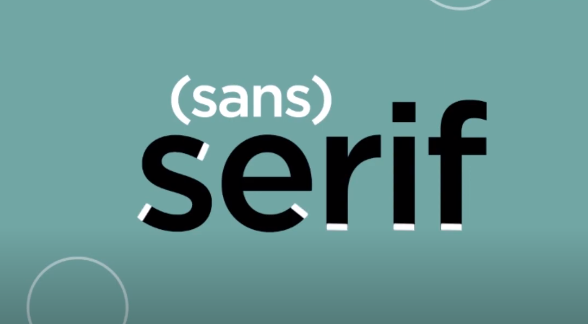
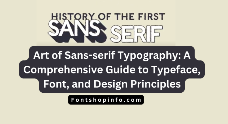
The phrase “Sans-serif” is a cornerstone of design that stands tall in the enormous field of typography.
To make material readable and visually appealing across a variety of media, fonts are essential.
Line Height Essentials
The subtleties of Sans-serif typefaces will be examined, along with related subjects including typeface classification, design principles, and the craft of type anatomy, in this extensive guide.
Understanding Sans-serif Fonts
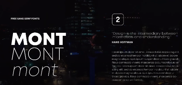
A typeface style known as sans-serif, which translates from French to mean “without serif,” is distinguished by its clear lines and lack of tiny projecting lines at the ends of characters.
Sans-serif typefaces are a popular choice in both print and digital design because of their simplicity, which fits well with a modern and minimalist look.
Popular Sans-serif Fonts
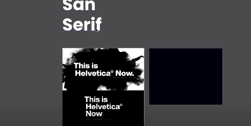
Helvetica
- Helvetica has established itself as a typographic icon thanks to its classic and understated style. Helvetica is a popular font for branding and signage because of its adaptability and ability to project a polished, professional image.
Arial
- Commonly likened to Helvetica, Arial is a popular and legible typeface. It has become a standard in online design because of its inclusion in numerous default font lists, which guarantees consistent legibility across multiple platforms.
Calibri
- Calibri, a typeface well-known for being approachable and contemporary, is now the standard in Microsoft Office programs. Its rounded curves add to the feeling of modernity and friendliness.
Verdana
- Verdana is frequently used for digital content since it was created with maximum legibility in mind. It’s a great option for website body content because of its clear lines and wide spacing.
Gill Sans
- The traditional British typeface Gill Sans successfully blends modernism and elegance. Gill Sans, which is frequently used in branding and print, gives any design a sophisticated touch.
Modern Sans-serif Families
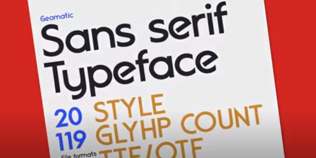
Numerous Sans-serif families have emerged as a result of typography’s progression, each with distinctive qualities.
This contemporary wave includes fonts like Open Sans, Roboto, and Lato, which give designers a wide range of possibilities for various situations.
Design Principles and Sans-serif Fonts
Clean Typography
- Sans-serif typefaces are excellent at producing simple, uncluttered typography. The information is easier to read because there are no serifs, giving the appearance a clear, uncluttered aspect.
Geometric Sans-serif
- Certain Sans-serif fonts, such as Futura, use geometric shapes to give them a contemporary feel. The sleek, futuristic appearance of these fonts makes them popular choices.
Humanist Sans-serif
- Traditional calligraphy is the source of inspiration for Humanist Sans-serif fonts like Gill Sans. This personal touch improves reading and lends a friendly, approachable vibe to the typeface.
Contrast and Legibility
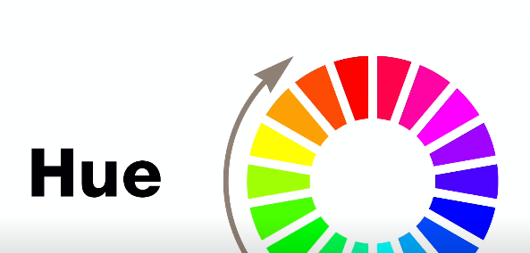
- Sans-serif fonts’ simple lines and minimalism add to their strong contrast and legibility, which makes them ideal for a variety of uses, including headings and body text.
Bold, Light, Condensed, and Extended Sans-serif Fonts
Bold Sans-serif
- Sans-serif typefaces in bold versions provide a powerful and captivating effect. They are frequently employed for emphasis and headlines.
Light Sans-serif
- Sans-serif typefaces in lighter weights have a delicate, airy quality. They work well for establishing a refined and understated mood.
Condensed and Extended Sans-serif
- Sans-serif typefaces that are condensed reduce space, which makes them perfect for tiny layouts. Extended versions, on the other hand, give the impression of being wider and more open.
Web-safe Fonts and Sans-serif
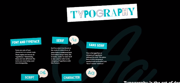
Web-safe fonts guarantee a uniform look across many platforms and web browsers. Sans-serif fonts are a common choice for web design because of their legibility on screens.
Safe picks for a smooth user experience are fonts like Arial and Verdana.
Type Design and Typography
Typeface Classification
- Sans-serif fonts can be classified as grotesque, neo-grotesque, geometric, or humanist. Knowing these categories enables designers to select the ideal typeface for a given set of design objectives.
Type Anatomy
- It is necessary to comprehend concepts like x-height, baseline, cap height, descender, and ascender to investigate the anatomy of Sans-serif fonts. This information is essential for accurate and beautiful typography.
Kerning, Tracking, and Leading
- Sans-serif typography relies heavily on adjusting the space between letters (kerning), words (tracking), and lines (leading) to achieve the best possible readability and visual balance.
Typeface Pairing and Font Styling
Sans-serif fonts add visual intrigue and hierarchy when used with complementing typefaces. Playing around with font weights, sizes, and styles enables designers to produce visually appealing layouts that are dynamic.
Conclusion
Sans-serif fonts are a monument to the strength of modernity and simplicity in design. The realm of sans-serif font provides designers with a wide range of possibilities, ranging from ageless classics like Helvetica to cutting-edge options like Roboto.
Gaining knowledge of font classifications, type anatomy, and clean typography principles enables designers to produce visually stunning and readable text.
Sans-serif typefaces continue to play a crucial role in influencing how we read and engage with written content even as we fully embrace the digital age.
FAQ
What is “Sans-serif” in typography?
“Sans-serif” refers to a typeface style without small projecting lines at character ends, known for its clean and modern look.
Why are Sans-serif fonts popular in design?
Sans-serif fonts are popular due to their simplicity, making them suitable for modern and minimalist design across both print and digital media.
Can you suggest some popular Sans-serif fonts?
Certainly! Popular choices include Helvetica, Arial, Calibri, Verdana, and Gill Sans, each offering unique styles and applications.
What defines modern Sans-serif families?
Modern Sans-serif families, like Open Sans, Roboto, and Lato, provide designers with diverse options, reflecting contemporary design trends.
How do Sans-serif fonts contribute to clean typography?
Sans-serif fonts create simple and uncluttered typography by lacking serifs, enhancing readability and visual appeal.
What are the characteristics of Geometric Sans-serif fonts?
Geometric Sans-serif fonts, exemplified by Futura, utilize geometric shapes for a sleek and futuristic appearance, making them popular for modern designs.
How does Humanist Sans-serif differ from other styles?
Humanist Sans-serif, like Gill Sans, draws inspiration from calligraphy, adding a personal touch and creating a friendly, approachable vibe.
Why are Sans-serif fonts recommended for web design?
Sans-serif fonts, such as Arial and Verdana, are web-safe and ensure consistent legibility across various platforms, contributing to a seamless user experience.
What is the importance of type anatomy in Sans-serif fonts?
Understanding type anatomy, including x-height, baseline, cap height, descender, and ascender, is crucial for achieving precise and beautiful Sans-serif typography.
How do designers use Sans-serif fonts for emphasis?
Designers use bold Sans-serif fonts for emphasis and headlines, while lighter weights create a delicate and refined mood. Condensed and extended variants offer versatility in layout design.
Why is typeface pairing essential in design?
Typeface pairing with Sans-serif fonts adds visual interest and hierarchy. Experimenting with font weights, sizes, and styles allows designers to create dynamic and engaging layouts.
