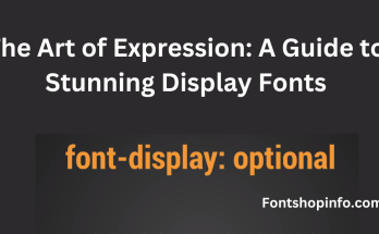
Font Design Principles
The importance of font design principles in the field of design cannot be emphasized. These guidelines are essential for creating typography that is both visually appealing and effective.
They cover everything from improving legibility to creating a visual hierarchy. This article delves into key font design principles, exploring concepts that contribute to the art of creating compelling typefaces.
Font Optimization Techniques
Legibility and Readability
Readability is the general ease with which a block of text can be read, whereas legibility is the degree to which individual characters can be easily identified.
Finding the ideal balance makes the font both aesthetically pleasing and useful by ensuring that the audience can easily consume the content.
Hierarchy and Contrast
The reader is guided through the content by a clear hierarchy that is established through the use of font size, weight, and style variations.
Contrast, in color or font features, draws attention to important details and creates visual interest, all of which combine to create a dynamic and captivating typographic experience.
Balance and Alignment
It’s imperative to achieve visual equilibrium to stop any one element from dominating the others.
A harmonious design is ensured by balance, and a polished, professional appearance is facilitated by alignment, resulting in a composition that is both aesthetically pleasing and well-structured.
Consistency and Proportion
A unified and cohesive appearance is encouraged by using consistent font selections and styling. A visually appealing and cohesive design is produced by adding harmony to the typographic composition through proportion, both in individual characters and the overall layout.
Spacing and Kerning
Tracking characters correctly and kerning individual character pairs have a big impact on the text’s overall appearance and readability.
Carefully chosen spacing contributes to a well-designed layout by improving the content’s readability and flow.
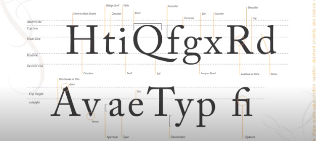
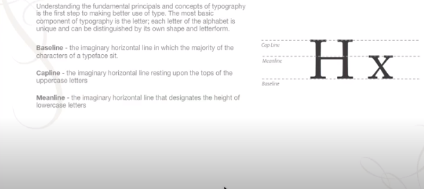
X-height, Baseline, and Descender/Ascender
It is essential to comprehend the structure of letterforms. The font’s distinct identity and character are influenced by the x-height, baseline, and descender/ascender dimensions, which also have an impact on the typeface’s overall balance and visual flow.
Serif, Sans-serif, Script, and Decorative Fonts
Selecting the ideal font is a skill. Serif fonts are formal and traditional; sans-serif fonts are modern; script fonts are elegant; and decorative fonts give the design personality. Every typeface selection gives the overall visual communication a unique tone and personality.
Stroke, Weight, and Italicization
The text’s visual weight is influenced by the character’s weight and stroke. When used sparingly, italics give the overall design more emphasis and variation, resulting in a complex and eye-catching typographic composition.
Cap Height and Letterform
Comprehending the intricate letterforms and cap height—the height of capital letters—contributes to a font’s individuality and distinctiveness.
A well-crafted typeface that stands out and communicates effectively is ensured by paying attention to these little details.
Negative Space, Positive Space, and Typography
To create a typographic composition that is both visually pleasing and well-balanced, one must have a strong understanding of negative (empty) and positive (filled) spaces. The design’s overall visual impact and readability are enhanced by the efficient use of space.
Typeface, Font Family, and Grid
Discovering the subtleties of font families and typefaces gives designers access to a wide range of tools. Using a grid system makes the layout more precise and structured overall, which results in a well-thought-out and aesthetically pleasing design.
Modularity
Accepting modularity in font design promotes adaptability and versatility, which qualify the typeface for a multitude of design uses. Elements of modular design enable flexible and consistent use in a variety of settings.
Conclusion
Learning the fundamentals of font design is a continuous process that combines technical know-how with creative intuition. By comprehending and putting these ideas into practice, designers can produce typography that not only effectively communicates with the audience but also makes a lasting visual impression. The concepts covered here provide a strong basis for obtaining typographic excellence, whether creating a dynamic marketing campaign or a sleek corporate identity.
FAQ
What are font design principles, and why are they important in design?
Font design principles are foundational guidelines that govern the creation of typefaces, influencing factors such as legibility, readability, and visual hierarchy. They are crucial in design as they ensure effective communication and contribute to the overall aesthetic appeal of typography.
How do legibility and readability differ in font design?
Legibility refers to how easily individual characters can be distinguished, while readability involves the overall ease of reading entire blocks of text. Striking a balance between the two ensures that the audience can effortlessly consume content, making the font both visually appealing and functional.
What role does hierarchy play in font design?
Hierarchy establishes a clear order in design through variations in font size, weight, and style. It guides the reader through content and, when coupled with contrast, enhances visual interest, emphasizing key elements and creating a dynamic typographic experience.
How does balance contribute to effective font design?
Achieving visual equilibrium through balance ensures that no single element overpowers others in the design. This creates a harmonious and visually pleasing composition, while alignment adds a polished and professional appearance.
Why is consistency important in font choices and styling?
Consistency promotes a cohesive and unified look in design. This extends to font choices and styling, creating a visually appealing and well-integrated typographic composition.
What is the significance of spacing and kerning in font design?
Proper spacing between characters (tracking) and fine-tuning individual character pairs (kerning) significantly impact the overall aesthetic and readability of text. Thoughtful spacing enhances flow and legibility, contributing to a well-crafted design.
How do typeface choices, such as serif, sans-serif, script, and decorative fonts, influence design?
Typeface choices convey specific tones and characters. Serif fonts suggest tradition and formality, sans-serif fonts exude modernity, script fonts bring elegance, and decorative fonts infuse personality into the design, allowing designers to communicate a desired mood or style.
What role do stroke, weight, and italicization play in font design?
Stroke and weight influence the visual weight of the text. Italics, when used judiciously, add emphasis and variation to the overall design, contributing to a nuanced and visually appealing typographic composition.
How do elements like cap height and letterform contribute to font uniqueness?
Understanding cap height (height of uppercase letters) and letterform intricacies contributes to the unique identity of a font. Attention to these details ensures a well-crafted typeface that stands out and communicates effectively.
What is the significance of negative space, positive space, and typography in design?
Mastery over negative (empty) and positive (filled) spaces is essential for creating a well-balanced and visually pleasing typographic composition. Effective use of space contributes to the overall visual impact and readability of the design.
How do typeface, font family, and grid impact the overall design structure?
Exploring typefaces and font families provides a diverse toolkit for designers. The use of a grid system adds structure and precision to the overall layout, contributing to a well-organized and visually appealing design.
Why is modularity important in font design, and how does it enhance adaptability?
Embracing modularity allows for versatility and adaptability in font design, making the typeface suitable for a wide range of design applications. Modular design elements facilitate consistent and flexible use across various contexts.