Typograph
The quiet force behind the visible language of design is typography. Typography is a diverse art that is essential to graphic design.
It ranges from the traditional elegance of serif fonts to the contemporary simplicity of sans-serif, and it involves the complex dance of letter spacing and leading.
Art of Sans-serif Typography
We will dive into the world of typography in this thorough book, examining its essential elements, design tenets, and useful applications to improve readability and aesthetics.
The Foundation: Typeface and Font
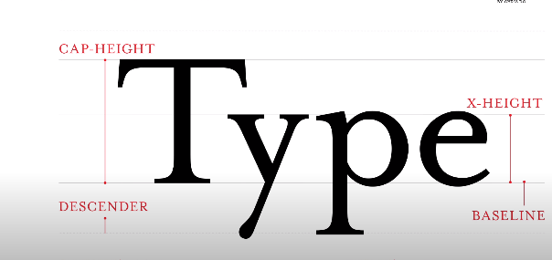
Fundamental to typography is the difference between a font and a typeface. A font is a particular style, weight, and size within a typeface family, whereas a typeface is a collection of letters with a unified design.
The first step to becoming an expert typographer is realizing this basic distinction.
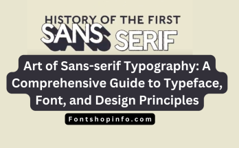
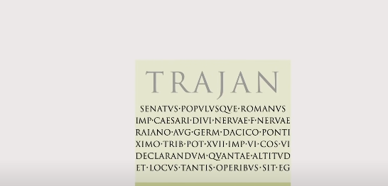
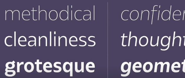
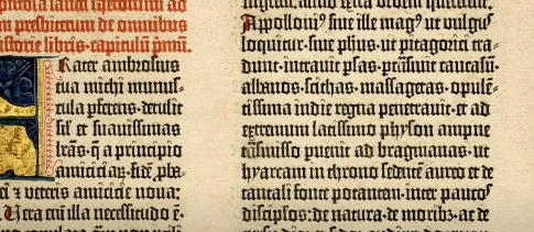
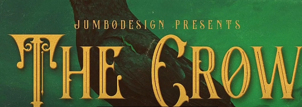
Serif vs. Sans-Serif: Choosing the Right Tone
The atmosphere and impression of a design are greatly influenced by the choice of serif versus sans-serif fonts.
Sans-serif typefaces have a contemporary, clean look, whereas serif fonts, with their ornamental flourishes, imply tradition and formality.
It’s important to match your font selection to both the overall design objective and the desired feelings.
Fine-Tuning: Kerning, Leading, and Tracking
Typographic harmony requires accurate modifications. Leading sets the vertical spacing between text lines, tracking establishes the overall spacing between all characters, and kerneling deals with the spacing between individual letter pairs.
Finding the ideal balance improves both readability and aesthetic appeal.
Creating Visual Hierarchy
One of the most effective tools for creating a visual hierarchy in a design is typography. Designers can successfully direct the viewer’s eye and prioritize information by adjusting font size, weight, and style.
This gives the design a feeling of order and enhances comprehension.
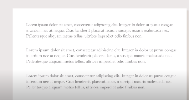
The Importance of Line Length and Alignment
Readability is directly impacted by the amount of lines in a block of text, sometimes referred to as line length.
The ideal line length guarantees that readers can follow the content with ease. Furthermore, appropriate alignment enhances the content’s overall visual flow, regardless of whether it is centered, justified, or left-aligned.
Playing with Contrast and Letter Spacing

Contrast gives typography more energy, both in terms of color and font weight. Subtle contrasts establish a feeling of balance, while bold choices highlight important components.
The text’s overall texture is influenced by letter spacing, also known as tracking. Through experimentation with these components, designers can create a distinctive and captivating typographic encounter.
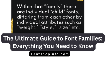
Exploring Font Families and Typeface Design
Font families provide creative flexibility by including a variety of styles into a single typeface. Conversely, the fine art of creating letterforms is part of font design.
Making sense of typeface anatomy and exploring the vast world of font families helps designers make wise decisions.
The Art of Ligature and Font Weight
Ligatures, which give typography a refined touch, are the creative linking of two or more characters. Font weight, which can range from light to bold, affects how a design looks.
Typography may be elevated to new heights through the art form of balancing font-weight and ligatures.
Emphasizing with Italics and Bold
Bold styling and italics are effective instruments for expressiveness and emphasis. When bold and italics are used sparingly, they can give a dynamic element to the text and assist in expressing a sense of urgency, importance, or originality.
Mastering Font Size for Readability
One of the most important aspects of readability is font size. To create a comfortable reading experience, the font size and line length must be balanced properly.
Legibility needs to be the first consideration when designing for digital or print media.
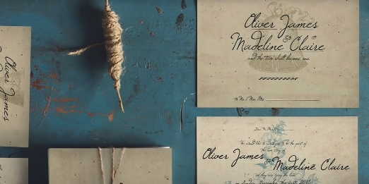
Beyond Basics: Calligraphy and Graphic Design
Typography is not limited to print and digital screens. Calligraphy gives designs a unique and creative touch because of its handwritten letters.
Gaining an understanding of the relationship between calligraphy and graphic design allows for new avenues for artistic expression.
Design Principles: Grid Systems and Layouts
Typography gains structure and order when design concepts like grid systems and layouts are used.
As well as providing a foundation for text and picture arrangement, intelligent layouts can improve overall aesthetics. The foundation of good typography in graphic design is these ideas.
Navigating Typography Rules and Type Design
There are rules for every kind of art, and typography is no different. A polished and businesslike result is ensured by comprehending and following these guidelines, which include preserving uniformity and minimizing excessive variety.
Moreover, learning type design enables designers to produce unique fonts for certain tasks.
The Art of Font Pairing and Readability
Choosing complementing typefaces to combine visually pleasing combinations is known as font matching. But it’s important to find a balance between readability and inventiveness.
A well-balanced combination of typefaces improves the overall appearance of the design without detracting from the readability of the text.
Typography in Action: Examples and Generators
As an illustration of the ideas we mentioned, let’s look at some practical typographic examples.
Furthermore, typographic generators are useful resources for experimenting with various font sizes, styles, and layouts. With the help of these tools, designers may easily refine their typographic selections.
Typography’s Role in Branding: Logos and Art
Typography is essential to brand identification, particularly when designing logos. A brand’s ability to be recognized and remembered is influenced by the typeface, style, and layout choices used.
Brand communication is improved by knowing how to use typography in logo design and other artistic expressions.
The Varied Landscape of Typography Art
Beyond its practical use, typography is an independent art form. Creative word and letter combinations are used in typography art to tell tales, elicit feelings, and deliver messages.
Examining typographic art’s varied terrain reveals the seemingly endless possibilities in this ever-evolving area.
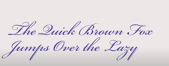
Diverse Types: A Journey through Typography Fonts
A wide variety of typefaces, each with its distinct personality and style, are included in typography. The universe of typographic typefaces is vast and varied, ranging from traditional serifs to modern sans-serifs and beautiful scripts.
Comprehending the attributes of several font styles enables designers to make well-informed decisions for a range of projects.
Typography MUI: Merging Technology and Design
Technology and aesthetics are combined in Material User Interface (MUI) design typography. MUI typography is concerned with using deliberate font selections and layouts to produce fluid and intuitive user experiences.
Examining typographic MUI principles improves the usability of digital interfaces.
Typography Examples: Showcasing Best Practices
To strengthen our comprehension, let’s look at actual instances of powerful typography in many settings.
These illustrations show optimal approaches to font matching, layout, and color usage, offering insightful information to both inexperienced and seasoned designers.
Unlocking Creativity: Typography Generator Tools
Typography generators are a great resource for designers who want to improve their process or find inspiration.
Designers can quickly experiment with fonts, styles, and layouts thanks to these tools, which encourage creativity and help them hone their typographic decisions.
Typography in Graphic Design: A Harmonious Blend
Typography plays a major role in graphic design to express ideas, elicit feelings, and create brand identification.
Comprehending the mutually beneficial association between typography and graphic design is important for producing aesthetically captivating and effectively conveying designs.
Types of Typography: A Comprehensive Overview
Let’s review the many forms of typography we have covered as we draw to a close our exploration of the world of typography.
Typography’s adaptability is visible in everything from digital interfaces and creative expressions to conventional print typography.
This thorough analysis acts as a reference manual for designers navigating the complex world of type.
FAQ
What is Typography and why is it important in graphic design?
Typography is the art of arranging and designing type to make written language readable and visually appealing. In graphic design, it is crucial as it sets the tone, enhances readability, and conveys messages effectively.
What is the difference between a Typeface and a Font?
A typeface is a collection of letters with a unified design, while a font refers to a specific style, weight, and size within that typeface family.
How does the choice between Serif and Sans-Serif fonts impact design?
Serif fonts convey tradition and formality, while Sans-Serif fonts offer a modern and clean look. The choice influences the overall mood and perception of a design.
What are Kerning, Leading, and Tracking, and why are they important?
Kerning adjusts the spacing between individual letter pairs, leading sets the vertical spacing between text lines, and tracking controls the overall spacing between characters. These adjustments are crucial for achieving typographic harmony and readability.
How does Typography contribute to creating visual hierarchy in design?
Typography helps establish a visual hierarchy by manipulating font size, weight, and style. This guides the viewer’s eye and prioritizes information, enhancing both comprehension and aesthetics.
What role do Line Length and Alignment play in Typography?
Line length impacts readability, and proper alignment (centered, justified, or left-aligned) enhances the overall visual flow of the content.
How does Contrast and Letter Spacing influence Typography?
Contrast, in both color and font-weight, adds energy to typography. Letter spacing, or tracking, influences the overall texture of the text. Balancing these elements creates a distinctive and captivating typographic experience.
What are Font Families, and how is Typeface Design related to Typography?
Font families include a range of styles within a single typeface. Typeface design involves crafting letterforms and understanding typeface anatomy to make informed design choices.
What is the significance of Ligature and Font Weight in Typography?
Ligatures add a refined touch through the creative linking of characters, while font-weight, from light to bold, influences the design’s appearance.
How can Italics and Bold be effectively used in Typography?
Italics and bold styling serve as powerful tools for emphasis and expressiveness. When used judiciously, they add a dynamic element to the text.
How does Font Size impact Readability, and why is it important?
Font size is critical for readability, and finding the right balance with line length ensures a comfortable reading experience in both digital and print media.
What is the role of Typography in Branding, especially in Logo Design?
Typography is integral to brand identity, influencing the recognition and recall of a brand through typeface, style, and layout choices.
How does Typography contribute to Artistic Expressions, such as Calligraphy?
Typography extends beyond functionality to artistic expressions like calligraphy, adding a unique and creative touch to designs.
What are the Design Principles like Grid Systems and Layouts in Typography?
Grid systems and layouts provide structure and organization to typography, improving overall aesthetics and readability in graphic design.
Are there Rules in Typography, and what is the significance of Type Design?
Following typography rules ensures a polished result, and understanding type design allows designers to create custom fonts for specific projects.
How does Font Pairing contribute to Readability and Aesthetics in Design?
Font pairing involves choosing complementary typefaces and striking a balance between creativity and readability to enhance the overall design.
Can you provide Examples of Effective Typography and the use of Generator Tools?
Real-world examples showcase best practices in typography, and generator tools allow designers to experiment with various font styles, sizes, and layouts.
How does Typography play a role in Material User Interface (MUI) design?
Typography in MUI design focuses on creating fluid and intuitive user experiences through deliberate font selections and layouts.
What are the Various Types of Typography, and how do they differ?
Typography encompasses a wide range of fonts, from traditional serifs to modern sans-serifs and decorative scripts, each with its unique style and personality.
How can Typography be leveraged for Creative Expression and Art?
Typography art involves creative word and letter combinations to tell stories, evoke emotions, and deliver messages, showcasing the limitless possibilities within this dynamic field.