Font Legibility

The importance of typeface and font legibility in the context of design and communication cannot be emphasized. It acts as a unifying factor, guaranteeing that your message is both visually appealing and easily comprehended.
Also Check Font Design Principles
Making thoughtful choices about fonts, sizes, and styles can have a significant effect on how readable your writing is. We will explore the essential elements that affect font readability in the conversation that follows, revealing a complex web of different typographic best practices.
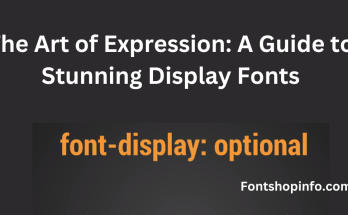
Serif Fonts vs. Sans-serif Fonts
It is essential to have a basic awareness of the differences between serif and sans-serif fonts. Classics like Times New Roman are prime examples of serif typefaces, which feature tiny ornamental lines at the extremities of characters.
Conversely, sans-serif typefaces like Arial eschew these extras to convey a sleek, contemporary look. Sans-serif typefaces give off an air of modern simplicity, whereas serif fonts frequently conjure up images of tradition and formality.
Typeface Legibility
The overall layout and font legibility of a typeface have a big impact on how easily a reader can understand the content.
Choosing typefaces that have been well designed not only improves readability overall but also makes text readable. This makes reading easier.
Font Size
Optimizing readability requires careful consideration of font size adjustments. Finding the right balance is crucial since too small writing might strain the reader’s eyes, and too large a font can come across as unprofessional.
Achieving the ideal balance guarantees that your material is both aesthetically pleasing and easily accessed.
Line and Character Spacing
Carefully arranging the distance between lines and characters helps to keep text from looking crowded or disorganized.
The text flows more easily when there is enough space between sentences, which makes it easier for readers to read and understand.
Letterform Clarity
To improve legibility, typefaces with distinct and unambiguous letterforms are essential.
It is important to choose fonts with clear letterforms because those with ambiguous or too beautiful letterforms can make them difficult to read.
Typeface Contrast and Weight

Effective use of contrast and weight in your selected typefaces helps draw attention to important details.
For example, bold fonts work well to draw attention to headings, but regular or light weights work better for body content and help create a pleasing visual hierarchy.
Font Style and Hierarchy
Creating a distinct typeface hierarchy is essential to helping readers navigate your material. Using distinct font styles—like bold or italic—makes it easier to discern headings from body text and produces a more aesthetically pleasing layout that is easier to read.
X-Height and Kerning
A balanced and visually appealing typographic design is mostly dependent on factors like kerning—the alteration of the space between characters—and x-height, which refers to the height of lowercase letters.
Leading
To avoid having text that is too packed or constricted, leading—the vertical space between lines of text—must be maintained. Making sure there is enough leading is essential to increasing readability overall and making reading more comfortable.
Font Color and Accessibility
Selecting a font color is an important aspect of accessibility as well as aesthetics. Aiming for a high contrast between the background and the text improves readability, especially for those who are visually impaired.
Conclusion
To summarize, becoming proficient in font legibility requires a careful combination of typefaces, sizes, styles, and spacing.
Through the application of these tried-and-true typographic best practices, you may create visually striking and easily readable material. Spend some time experimenting with different font pairings and styles, bearing in mind the demands of your design as well as the tastes of your intended audience.
By doing this, you give your message the most chance of successfully connecting with your audience.
FAQ
Why is font legibility important in design and communication?
Font legibility is crucial as it ensures that your message is visually appealing and easily understandable. It plays a key role in capturing the audience’s attention and conveying information effectively.
What is the difference between serif and sans-serif fonts?
Serif fonts, like Times New Roman, have decorative lines at the end of characters, while sans-serif fonts, such as Arial, lack these embellishments. Serif fonts often evoke a traditional feel, while sans-serif fonts convey a modern aesthetic.
How does typeface legibility affect reading?
The design and clarity of a typeface significantly impact a reader’s ability to interpret text. Well-designed typefaces enhance both legibility and overall readability.
Why is adjusting font size important for readability?
Font size directly influences readability. Finding the right balance ensures that text is accessible and visually appealing, preventing eye strain or the appearance of unprofessionalism.
What role does line and character spacing play in typography?
Proper spacing prevents text from appearing cramped or scattered, enhancing the flow of the text and making it easier for readers to follow.
How do letterform clarity and font choice contribute to legibility?
Choosing fonts with clear and distinct letterforms is essential for legibility. Fonts with ambiguous or overly decorative letterforms can hinder understanding.
In what ways does typeface contrast and weight impact typography?
Typeface contrast and weight emphasize key information. Bold fonts are effective for headings, while regular or light weights are suitable for body text, creating a visual hierarchy.
Why is establishing font hierarchy important in content layout?
Font hierarchy guides readers through content. Different font styles, like bold or italic, distinguish headings from body text, creating a visually organized structure.
What is the significance of x-height and kerning in typography?
X-height, the height of lowercase letters, and kerning, the adjustment of space between characters, contribute to a balanced and harmonious visual appeal in typography.
How does leading impact the overall readability of text?
Leading, the vertical space between lines of text, is essential for preventing overcrowded or cramped text. Adequate leading improves overall readability.
Why is font color important, and how does it relate to accessibility?
Font color is crucial for both aesthetics and accessibility. High contrast between text and background enhances readability, especially for users with visual impairments.