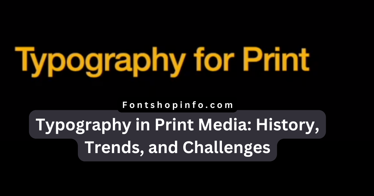
Typography in print media
Typography in print media, such as books, magazines, newspapers, and more, typography is the process of making text on paper look attractive and readable.
Typography can convey the artistry, originality, and personality of the author or publisher while also enhancing readers’ comprehension and enjoyment of the text. Considerations for typography include typeface, font, size, color, contrast, alignment, spacing, layout, and text composition.
Typography can inspire, instruct, and amuse the reader in addition to improving, amplifying, and adding value to the text. In addition to being a skill, typography is an art and a passion.
Text may be made to look good and be easy to read by using typography. For publications with words on them, such as books, magazines, newspapers, and other items, it is crucial.
Typography can improve a reader’s comprehension and enjoyment of the text. We’ll learn more about typography and its importance for print media in this article.
Since people first began printing words on paper, typography has existed for a very long period. Over time, new concepts, tools, and writing styles have all contributed to significant changes in typography. Typography is a means to express art, creativity, and individuality in addition to words.
Typography can do many things, such as:
- Telling the meaning and message of the text. Typography can help show what the text is about and how the writer or the publisher wants to say it. Typography can also make some parts of the text more important or more interesting than others.
- Making the text easy and fun to read. Typography can help people read and understand the text better and faster. Typography can also make the text fit well on the page, depending on how big, how good, and how many pages there are.
- Making the text beautiful and emotional. Typography can make the text look nice, cool, and exciting for the reader. Typography can also show the feeling, mood, and type of the text, as well as the style and identity of the writer or the publisher.
Typography has many things to think about, such as:
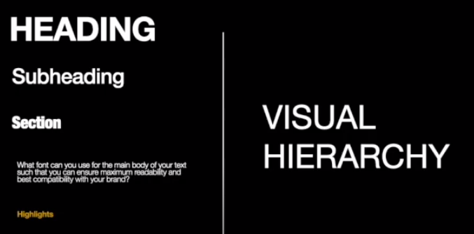
- Typeface and font. A typeface is a group of letters that have the same design and style, like Arial, Times New Roman, or Helvetica. A font is a specific size, weight, and style of a typeface, like Arial 12 pt bold italic. Typeface and font can make the text look different, like friendly, serious, or funny, as well as easy or hard to read.
- Point size and line height. Point size is how tall the letters are, usually in points (1 point = 1/72 inch). Line height is how much space there is between the lines of text, usually in points or percentages. Point size and line height can make the text look more or less crowded, clear, and comfortable, as well as easy or hard to read.
- Color and contrast. Color is how bright and colorful the text is, usually in RGB (red, green, blue) or CMYK (cyan, magenta, yellow, black) values. Contrast is how much difference there is between the text and the background, usually in percentages. Color and contrast can make the text look more or less visible, attractive, and happy, as well as easy or hard to read.
- Alignment and spacing. Alignment is where the text is on the page, like left, right, center, or justify. Spacing is how much space there is between the letters, words, and paragraphs of the text, usually in points or percentages. Alignment and spacing can make the text look more or less orderly, balanced, and harmonious, as well as easy or hard to read.
- Layout and composition. The layout is how the text and other things, like pictures, graphics, and icons, are arranged and organized on the page, like a grid, column, or modular. Composition is how the text and other things relate and work together, like close, aligned, contrasted, and ranked. Layout and composition can make the text look more or less structured, logical, and flowing, as well as easy or hard to read.
Typography is a fantastic and practical tool for improving, enhancing, and adding value to text. The modern world, with its digital, global, and green aspects, can also be represented through typography, along with its new issues and solutions. Together with the writer and designer, typography can also instruct, inspire, and amuse the reader. In addition to being a skill, typography is an art and a passion.
FAQ
What is typography in the context of print media, and why is it important?
Typography in print media refers to the art and science of making text on paper visually appealing, legible, and impactful. It involves choosing the right typefaces, fonts, sizes, colors, contrasts, alignments, spacing, layout, and text composition to enhance the overall reading experience. Effective typography not only improves readability but also communicates the author’s or publisher’s creativity, personality, and intent, adding value to the printed content.
How does typography benefit print media?
Typography serves several essential purposes in print media:
- Conveying Meaning and Message: Typography helps convey the essence and message of the text, offering insights into its subject matter and how the author or publisher intends to communicate it. It can also emphasize specific sections or ideas within the content.
- Enhancing Readability and Enjoyment: Well-executed typography ensures that the text is easy to read and comprehend, enhancing the reader’s overall experience. Proper typographic choices, including font size, style, and layout, contribute to efficient reading and page fit.
- Adding Aesthetic Appeal and Emotional Impact: Typography can elevate the visual appeal of the text, making it attractive, engaging, and emotionally resonant. It can convey the tone, mood, and style of the content while reflecting the writer’s or publisher’s unique identity.
What are the key elements to consider in typography for print media?
Typography involves various elements that need careful consideration:
- Typeface and Font: Selecting the right typeface and font style (e.g., Arial, Times New Roman, Helvetica) can influence the overall look and feel of the text. Different fonts convey various emotions and can affect readability.
- Point Size and Line Height: Point size, which determines the height of the letters (measured in points), and line height (spacing between lines) impact the text’s legibility, density, and overall comfort for readers.
- Color and Contrast: The color and contrast of the text play a significant role in visibility and attractiveness. Considerations include text color and its contrast against the background, as well as color choices in RGB or CMYK.
- Alignment and Spacing: Decisions regarding text alignment (left, right, center, or justify) and spacing between letters, words, and paragraphs significantly affect the text’s orderliness, balance, and readability.
- Layout and Composition: Layout refers to how text and other elements (e.g., images, graphics) are organized on the page, such as grid or column layouts. Composition deals with how text and other elements interact, impacting the overall structure and flow of the content.
How can typography reflect the modern world and its challenges in print media?
Typography is a versatile and practical tool that can help address contemporary challenges in print media. It can represent the digital, global, and environmentally conscious aspects of the modern world. Typography allows designers to communicate new issues and solutions in innovative ways. It can collaborate with authors and designers to instruct, inspire, and entertain readers. Typography is not just a skill but an art and a passion that enriches the reading experience in print media.